 Canada


In-House Coffee Packaging Design with Anna and Molly
Did you know that the packaging of our two newest coffee flavors, Crema Wave and Beamed Up, were dreamed-up in house? Anna Swiatowy and Molly Leo are the two designers behind these luscious, saturated designs. Beamed Up features chocolate and marshmallows floating inside a dark forest, while Crema Wave brings the coffee’s creaminess out through rich waves of blue and white.
In comparison to earlier coffee bags, Crema Wave and Beamed Up offer a more youthful, modern take on branding — an effort that was spearheaded by Jesse Salzman, Whole Latte Love’s Director of Operations. As for what spurred on the change, he had this to say:
“Part of my strategy for the bag designs was to take the flavor notes that were within each blend, and from those flavor notes, I then wanted us to take inspiration from culture — from cinema to music to fictional stories. With that in mind, I wanted us to craft our own story-driven illustrations. One of the main drivers for these designs was to have them stand-out and look nice on people’s countertops and on store shelves.”
One of the greatest gifts of designing something in house is that we get to talk to the mastermind creatives behind the scenes. Below you will find a conversation between Jessica Pavia, content writer, and the two designers, Molly and Anna. Find out where they looked for inspiration and more about their individual processes.
Jessica Pavia (JP): Did you both work on each design together, or were these independent projects?
Anna Swiatowy (AS): I only worked on Crema Wave, and Molly only on Beamed Up.
$39.99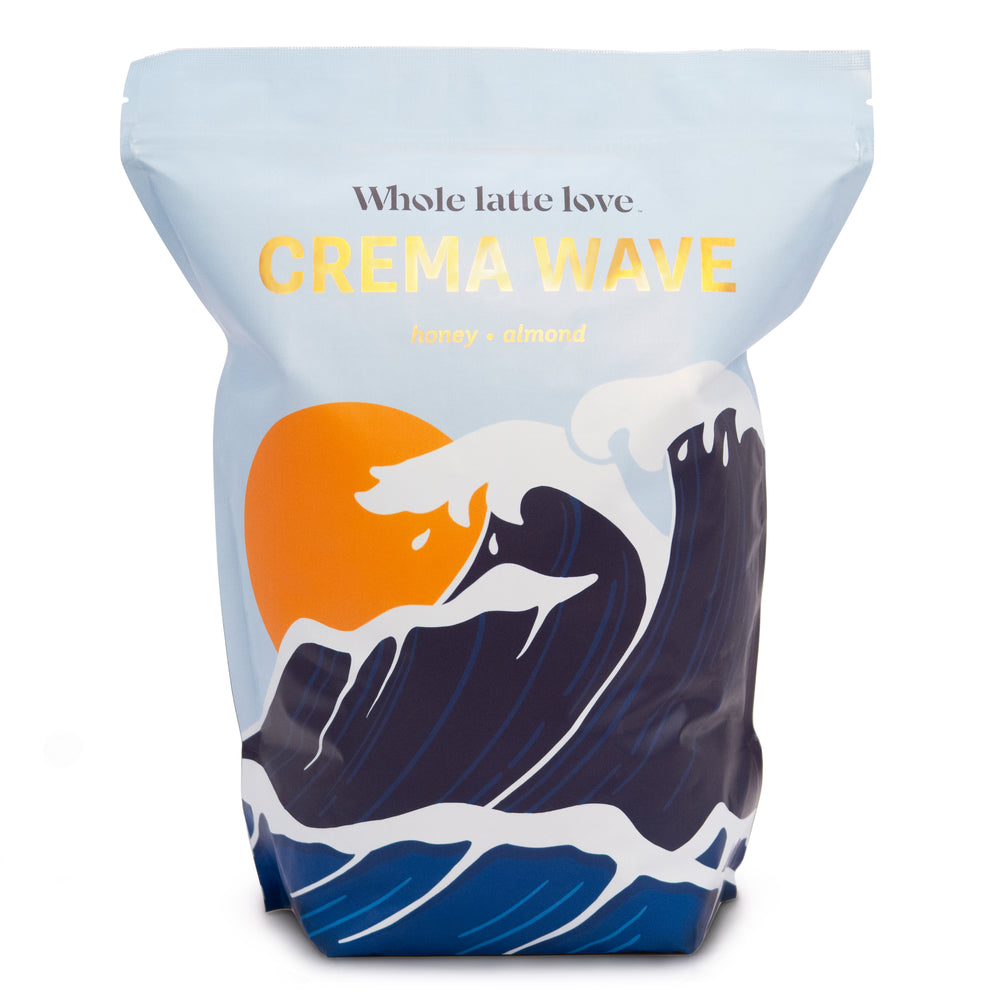
Molly Leo (ML): We had concepts for each of the coffees before, and then the designs we personally liked more were the ones we assigned ourselves to do.
JP: What themes and ideas were you hoping to convey? And how did you go about doing that?
ML: With Beamed Up, we originally referred to it as Roasted Not Burned — which was a joke from Nick Brown [E-Commerce Manager] and a James Bond reference. But Nick kept pointing out the flavor notes of the dark chocolate, the roasted marshmallows, the hint of berry. That made us think of the outdoors, which is where the inspiration of having a camp setting came from. It then moved into a weirder direction where I included aliens, and I even had something scarier in the beginning. But the main thing was we wanted to tell a story, and so that’s where my head was going.
AS: For Crema Wave, we were talking about carrying the story from the front of the design to the back. In the beginning, we were thinking about a tsunami hitting a small city, but we moved away from that because we wanted the image to look relaxing and creamy. The Crema Wave has notes of honey and almond, so I focused a lot on that creaminess which is where the white in the ocean waves comes from. We were looking at David Hockney, who creates minimalist paintings of water, for inspiration.
JP: Once you had these ideas or guidelines in place, what was the actual designing process like?
AS: With both of us, we threw in a ton of sketches and ideas in the beginning. Jesse and Nick would then help us narrow it down. We had Google Docs with lots of notes from our research, the kind of color palettes we wanted to use, what design directions we were going in, and lots of sketches.
ML: We also had mock-ups of coffee packaging that we could throw designs onto really easily to get a better sense of how this would look in real life, which helped a lot.
JP: What was it like working in house on this as a team?
AS: We met probably every other day and got very clear directions. Once we presented our ideas, in my opinion, we had a lot of creative freedom which made it fun to work on. Our ideas were welcomed. I thought it went really smoothly.
JP: What inspired this more minimal, modern look?
ML: The idea came a lot from Jesse, and it helped that Nick was also there to tell us what the flavors and profiles were. I only looked at some of our older designs and packaging, and while I love the artwork, having this new look not only boosts Whole Latte Love as a company and as a brand, but it makes us stand out more and brings us to the new elevation we have been working hard to achieve.
AS: This type of design makes us stand out. You don’t see a ton of packaging like this walking through the grocery store and, in my opinion, it will make more people want to buy it.
JP: Were you working off of a specific color palette?
AS: We both switched our colors a lot. My first palette went off the honey and almond tones, so my colors were warm and orangey. And so was Molly’s — she had this amazing deep orange.

JP: If you design more packages in the future, are you going to try and keep them in this family of blues and simple designs? Or because that was never a strict rule, do you see yourselves experimenting and trying new themes?
ML: I think we’ll keep them in the same color palette. The colors that we currently have are similar to a palette we already use for Whole Latte Love that includes secondary colors. Beamed Up’s purple background sky and the teal are part of it, Anna’s blues are as well. We have a wider range available to us that we can experiment with but I know even future designs will still match these.
AS: In the end, it’s more about keeping the actual type of design on each the same.
JP: How important do you think packaging is to how consumers view and decide on this coffee?
AS: It depends on the type of person.
ML: We really wanted something that would stand out on shelves and not be tucked away into a pantry.
JP: Any final comments?
AS: The coffee tastes as good as it looks. I’m not a coffee pro or anything, but when I brewed a cup with the Crema Wave, I noticed a quality difference for sure.